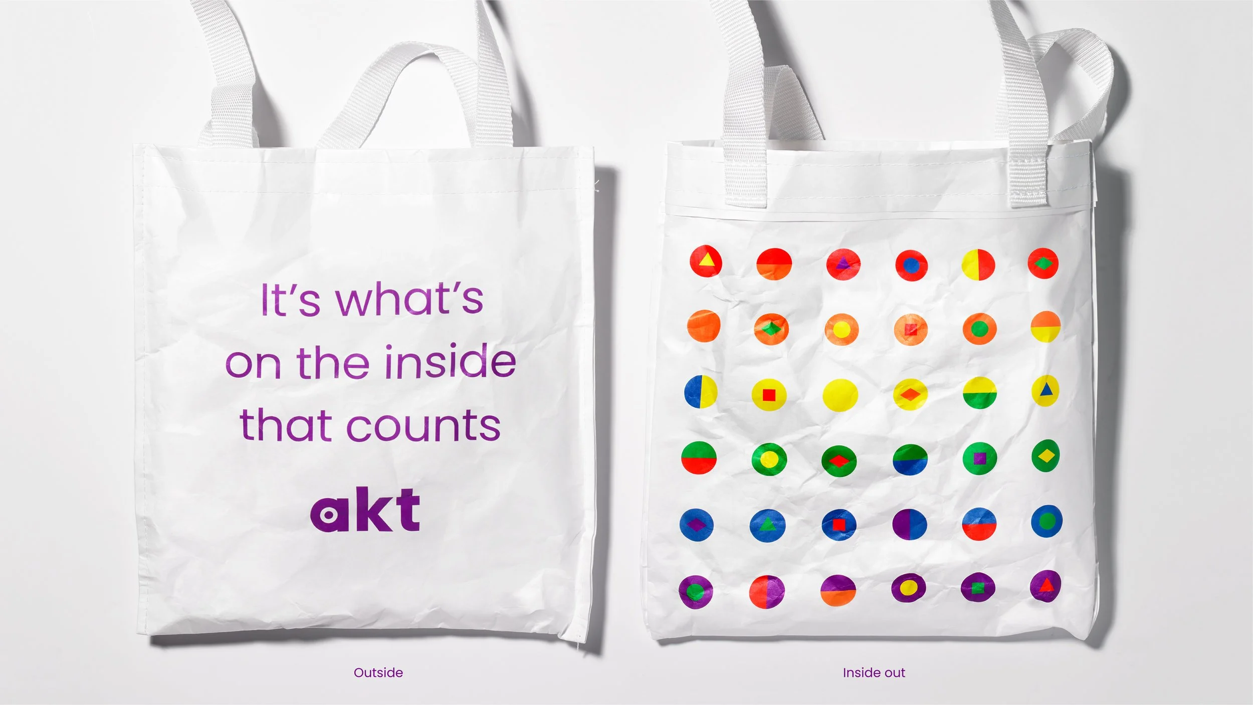
The strength of difference
Challenge
24% of young homeless people identify as LGBTQ+.
Named for Albert Kennedy, a social services care leaver from Manchester who died a tragic death aged just 16, akt is a charity whose goal is to ensure that no young person should have to choose between a safe home and being who they are.
How do you create a visual system to help reach some of the most vulnerable people in society?
Solution
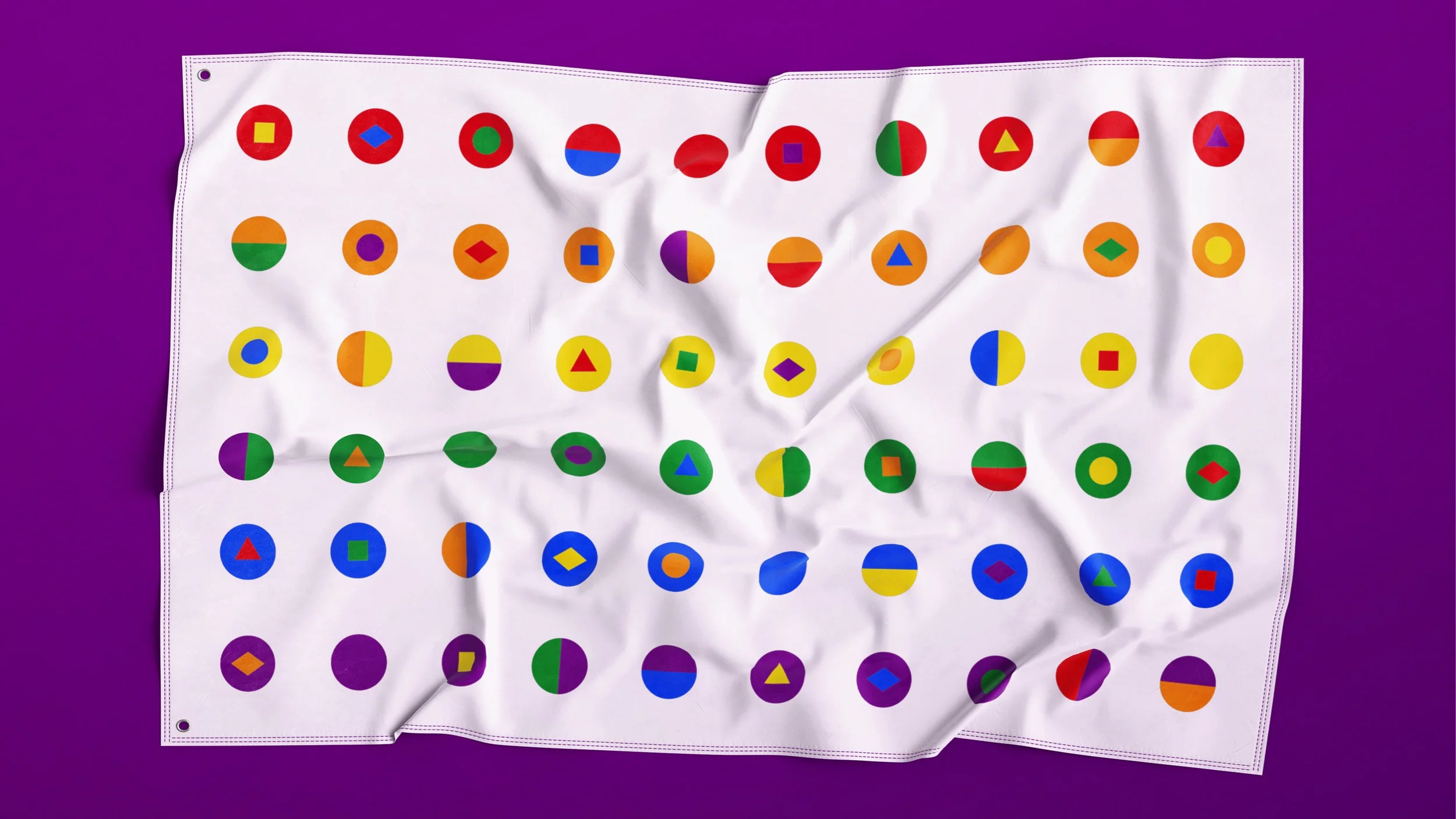
The existing design was deeply embedded in the harsh visual language of the streets – aggressive, distressed and grungy.
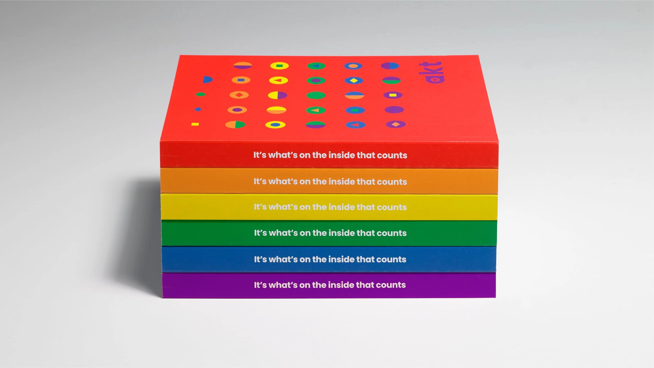
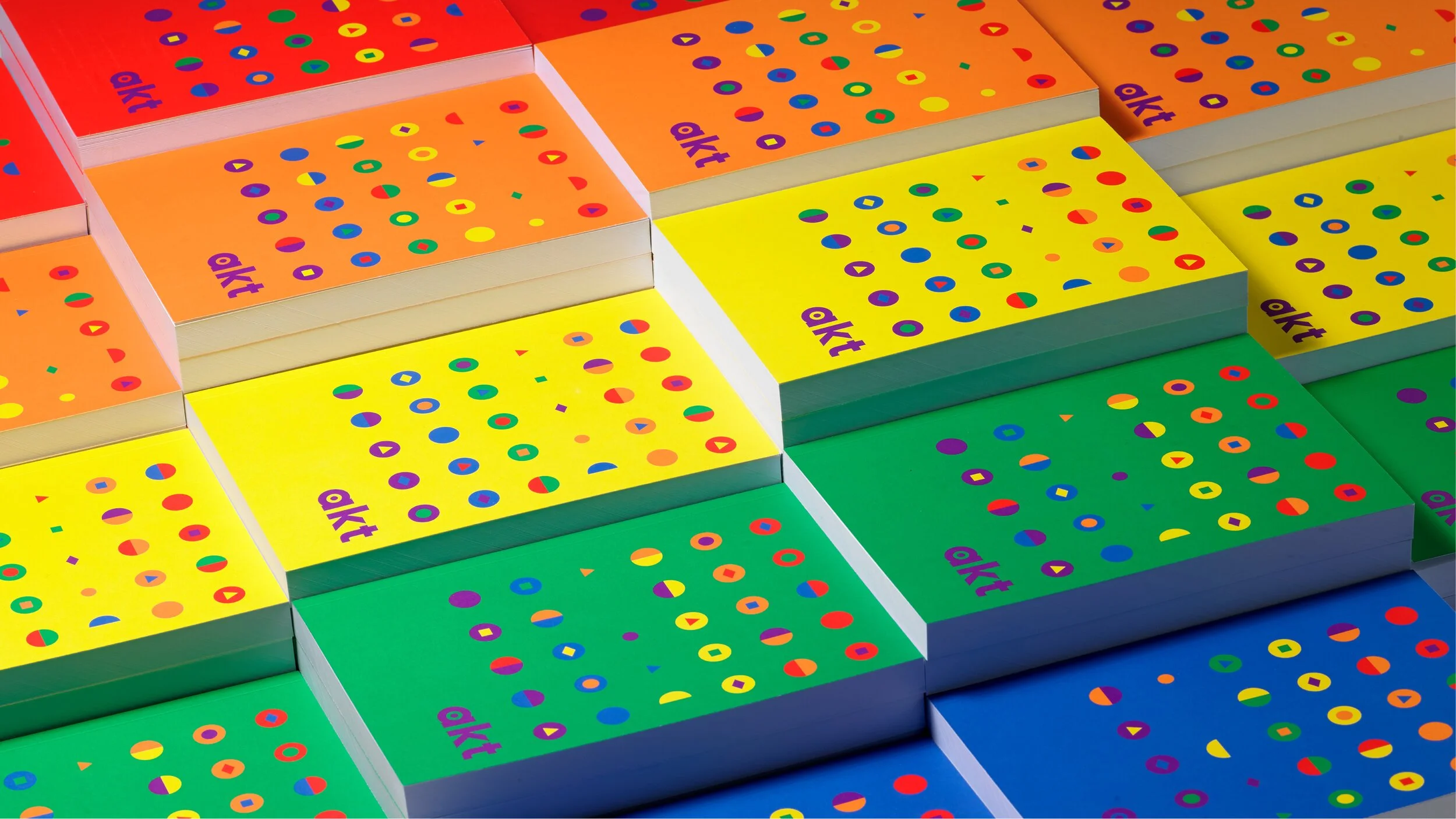
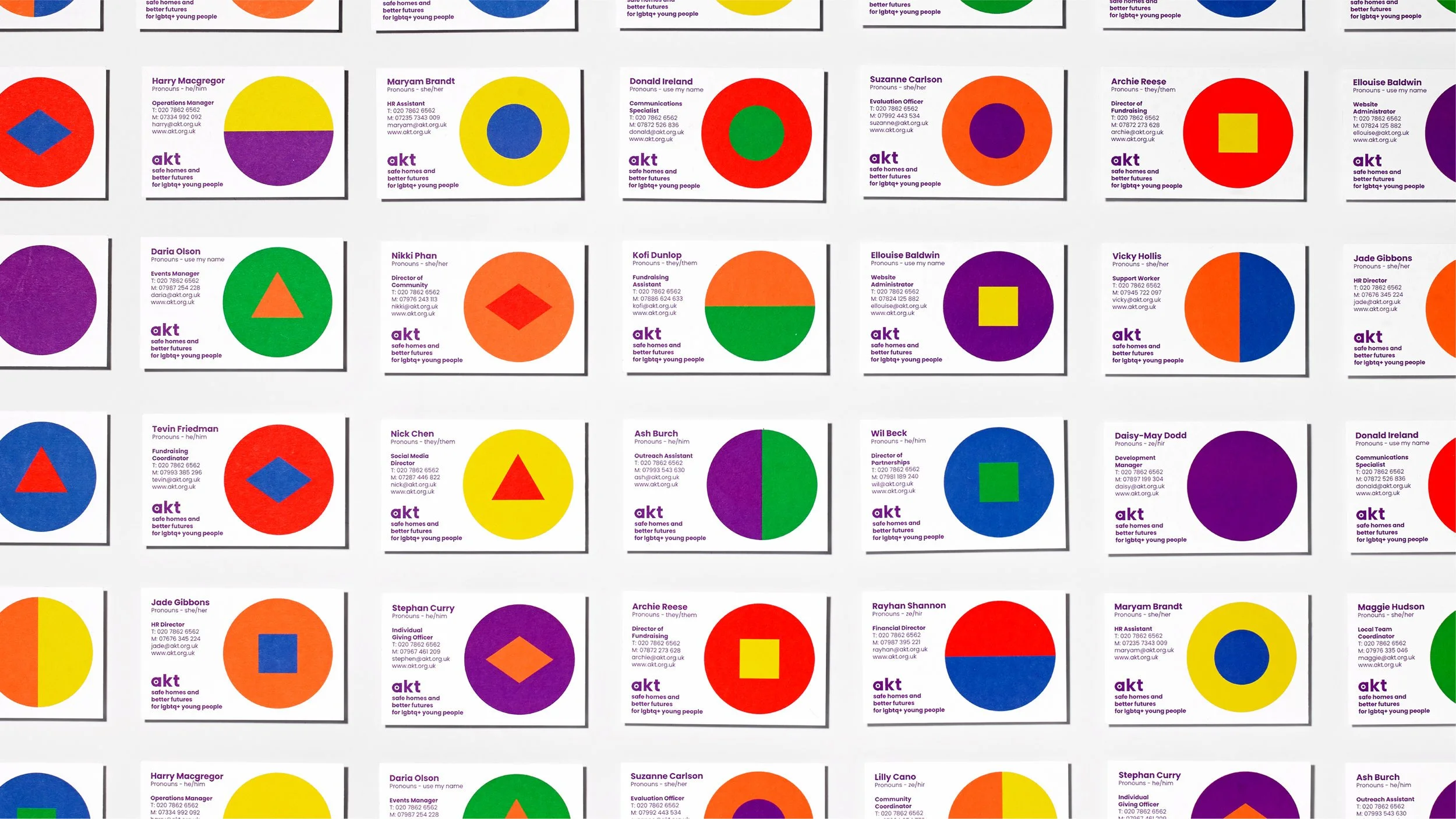
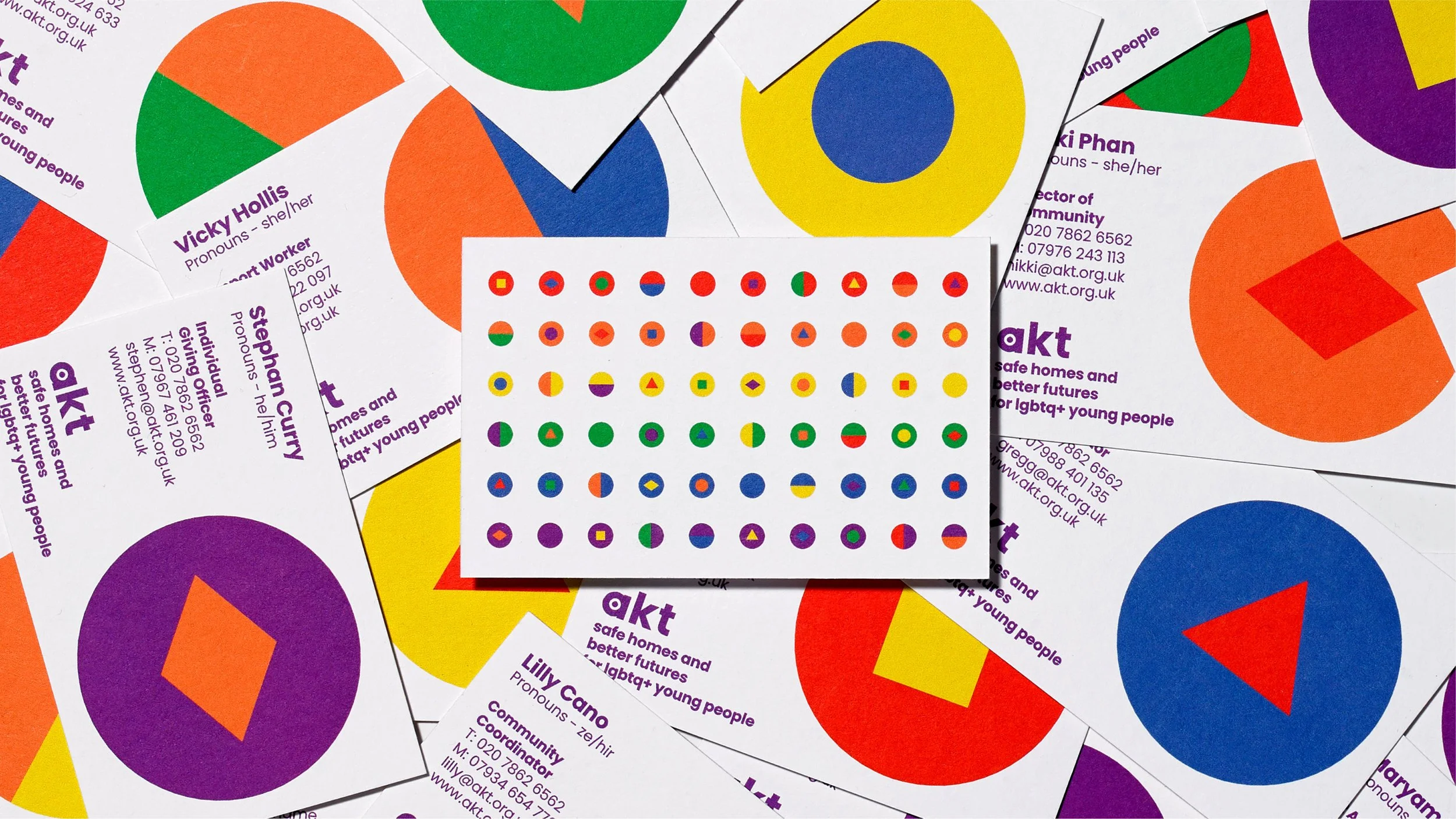
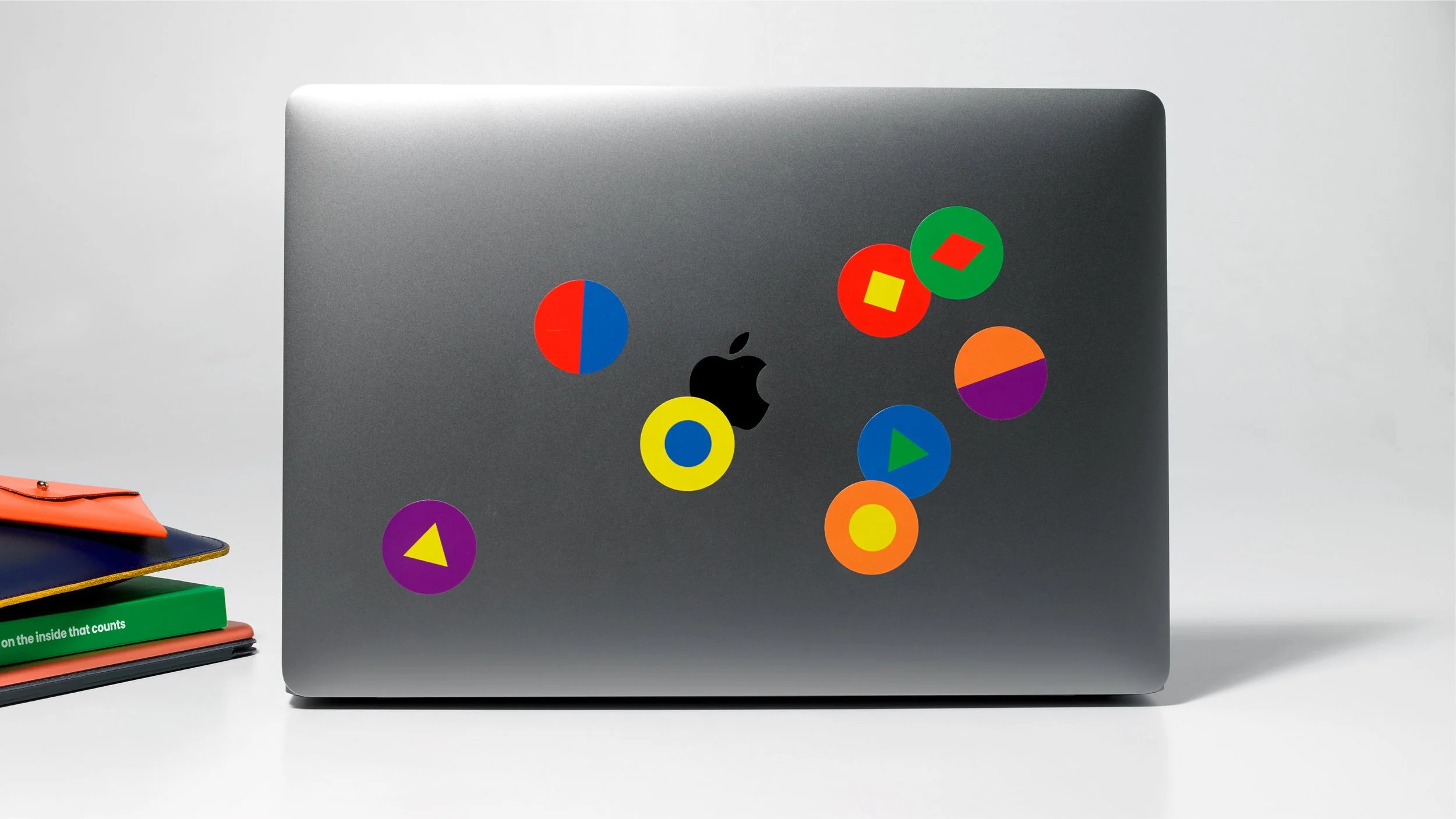
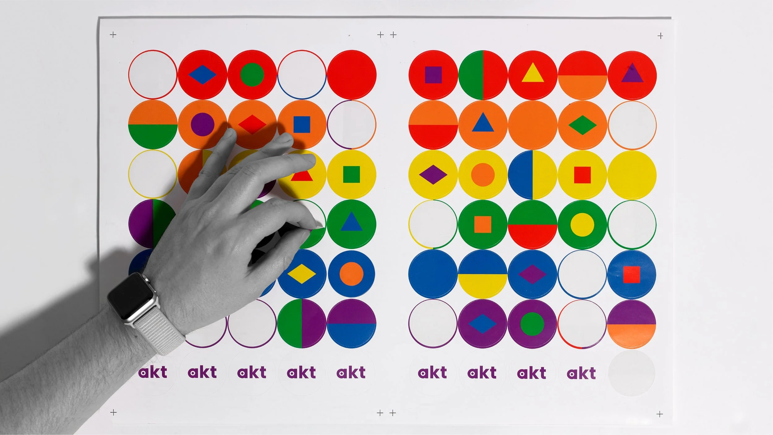
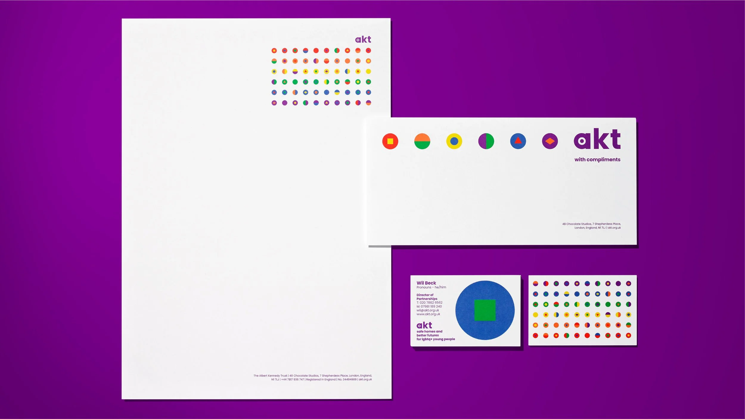
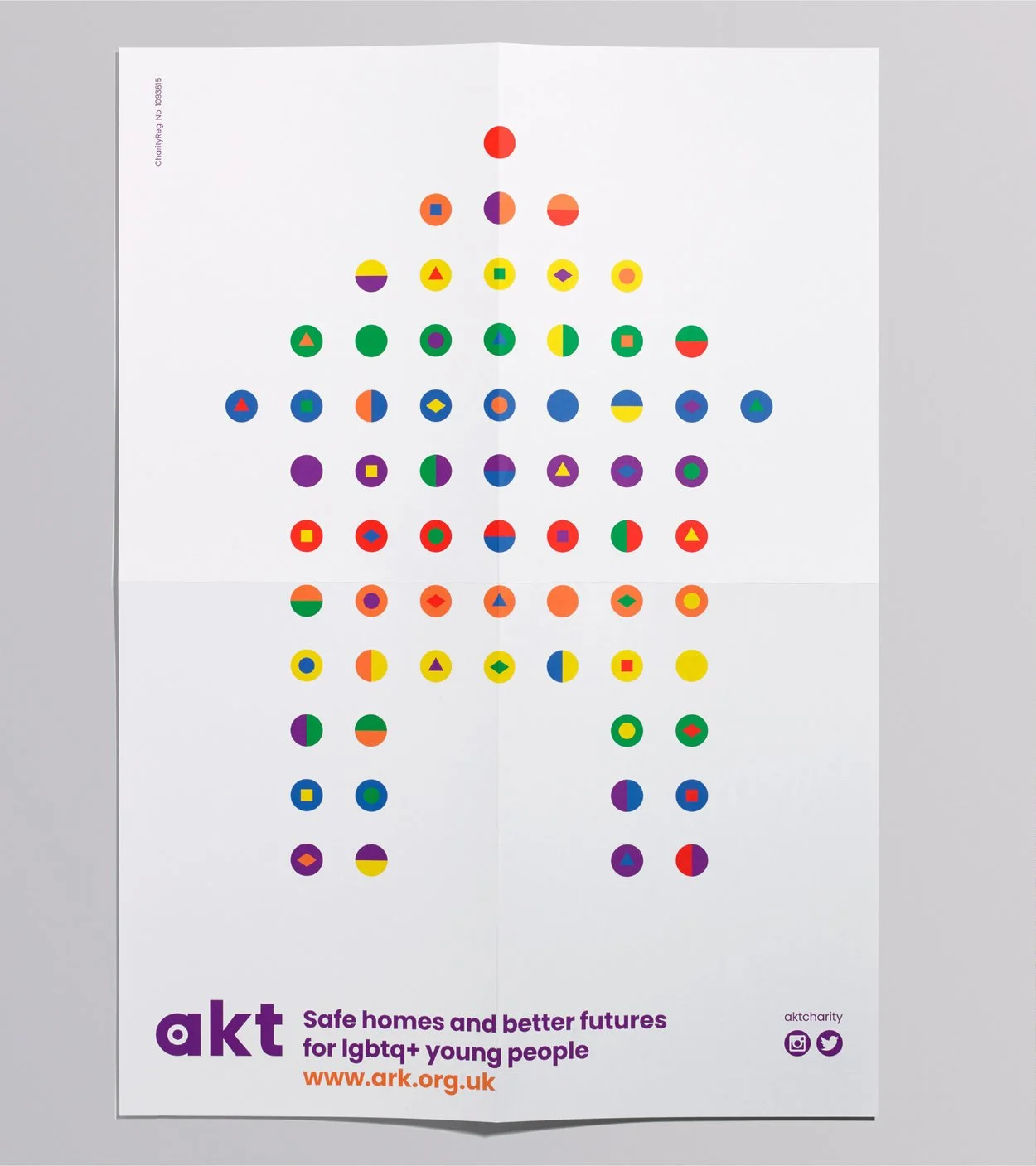
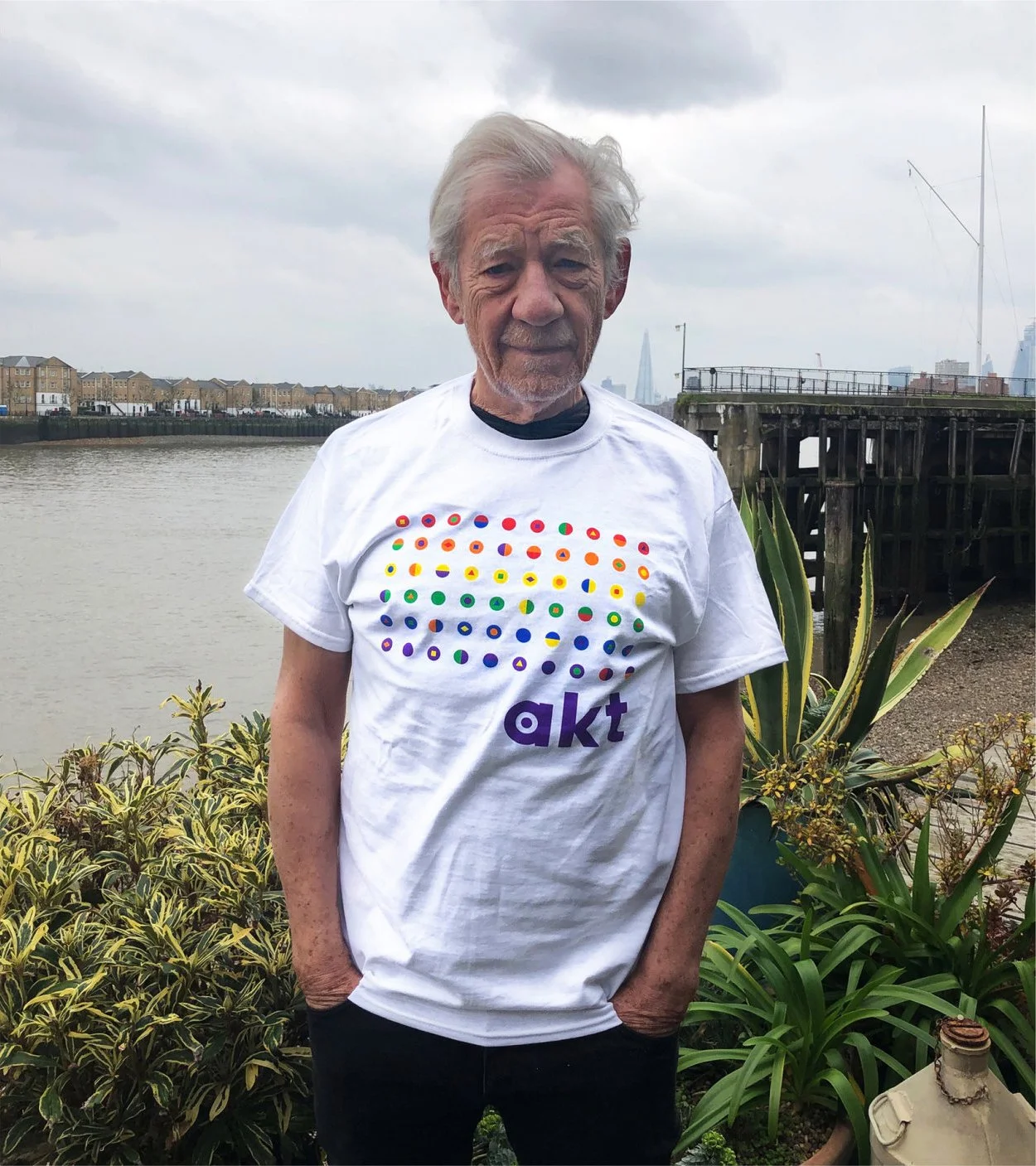
We decided to spin the narrative focus of the identity from the problem to the solution, utilising the colours of the iconic Pride flag to tell a new story about the strength of difference within a framework of supportive community.
Combined with friendly typography and a dynamic graphic system, akt now presents a vision of warmth and hope for a better future.
Skillsets
Brand Strategy
Brand Animation
Photography
Production
Recognition
Partners
Client: akt
Strategy: Deborah Taffler
Animation: Dan Kennington
Photography: Roger Stillman
Production: Lisa Stillman
Press
#fhcenterstage/0//Related projects